
Synchronised testing, Remote debugging, Edge case browsers, Viewport resizing.
Not so long ago, cross-browser testing meant firing up different versions of Internet Explorer, Chrome, Safari, Firefox and (possibly) Opera on multiple operating systems. Add in the ever-growing multitude of mobile devices now available, and it can be a real challenge developing your site to deliver a consistent experience to all.
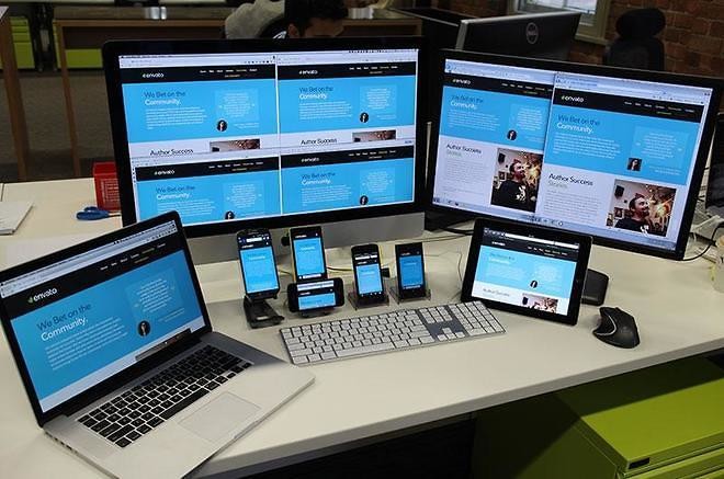
On the Envato Marketplaces we get over 16 million monthly visits, 6% of which are from mobile devices. We’re currently working on making the sites responsive, so having the right tools and cross-browser testing on a range of mobile devices is incredibly important. I’m going to take you through some of the options I’ve explored while setting up the cross-browser testing suite we use for the marketplaces, and some of the workflows and techniques that make us more efficient.
Goals and Challenges
When testing mobile and responsive sites on mobile devices there are basic factors to test for. Ask yourself:
- Does the site look ok?
- Are there any bugs?
- Does the user interaction feel good?
- Is the site optimised for mobile?
The ultimate goal is to deliver a consistent experience to users on a variety of devices and browsers. We’re using traffic data and survey results to help narrow down the devices on which we focus our mobile browser support, so that the changes we make assist the bulk of our users. Reviewing your own mobile traffic data and researching device stats usage is a great place to start deciding which devices and browsers to support.
When developing the marketplaces we run multiple local development servers which makes normal cross-browser testing complicated. Until recently we used a combination of Pow and xip.io on our development machines to serve the marketplaces to our testing devices and VMs.
Since beginning our journey to responsive enlightenment, this testing process has become even slower and more complicated. Due to the nature of the marketplaces, we want to focus on testing the same actions across a range of mobile devices and browsers. This means being signed in simultaneously on each device and simulating different scenarios.
Luckily there are some quality tools and techniques available to help alleviate the pain of developing and testing responsive websites, whether you own any testing devices or not.